Shelf Decor Ideas for Home: Stylish Styling and Organization Tips 2026
A blank shelf is one of the most underrated opportunities in any home. It’s visible surface space that most people either overcrowd with objects gathered over years or leave so sparse it reads as forgotten rather than intentional. Neither approach does the room justice.
Well-styled shelves are one of the highest-return changes a person can make to a living space — they’re visible from almost everywhere in the room, cost very little to transform, and tell visitors more about who lives there than almost any other interior detail. The goal is a display that feels personal and genuinely beautiful without looking assembled by formula, which is the same instinct behind styling a coffee table — just applied vertically instead of on one flat surface. This guide covers every principle worth knowing to make that happen.
Start with a Completely Blank Canvas

The single most important step in any shelf styling project is removing absolutely everything before placing anything back. Starting from a blank shelf shows the actual space available, how light falls across it, and which areas need visual anchoring most.
Clearing completely prevents the most common shelf styling mistake — rearranging existing objects without honestly assessing whether they still belong. Group everything removed into categories: books, plants, decorative objects, functional items. Seeing each category together gives a clearer picture of what’s genuinely worth keeping. The shelves that consistently look most considered start from a truly empty position.
Use Books as the Structural Foundation
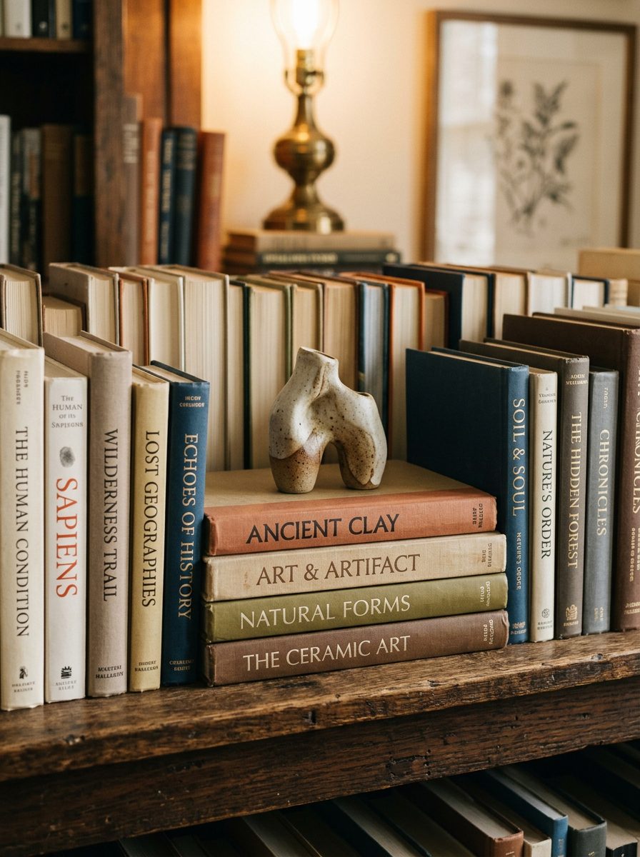
Books do three things at once on a shelf: fill space with warmth, create natural platforms for other objects, and say something real about the person who lives in the room.
Mixing horizontal stacks with vertical rows creates a relaxed, lived-in quality rather than a retail-styled one. Hardcover books add texture, especially with small decorative objects placed on top of horizontal stacks, and coordinating spine colours with the surrounding palette creates a particularly clean result. Always place books first — they establish the structure everything else is built on.
Add Plants and Greenery for Natural Life
Every well-styled shelf benefits from at least one organic element. Plants add natural life and unpredictable shape that no manufactured object can replicate, across every interior style from minimal Japandi to maximalist bohemian.
A trailing pothos, a small succulent, or dried olive branches add movement that keeps a display feeling alive rather than static. If the shelf doesn’t get enough natural light, a high-quality faux plant looks just as good with zero maintenance. Vary planter heights deliberately — tall stems beside low succulents create rhythm — and choose pots in terracotta, ceramic, or woven rattan that complement the room’s palette.
Establish Anchor Pieces and Supporting Items
Every great shelf display is built around an anchor piece — the largest, most visually dominant object on each level, typically one or two per shelf. It might be a bold ceramic vase, a significant piece of art, or an oversized candle in a substantial holder. This is the same logic behind choosing one statement piece rather than a cluster in our gallery wall guide — one dominant element gives the eye somewhere to land first.
Smaller supporting items — candles, small framed photographs, decorative boxes — fill in around the anchor without competing for attention. Distribute anchor pieces across different shelves rather than grouping them on one level, so the eye travels naturally across the whole display instead of stopping at one concentrated area.
Vary Height and Depth Deliberately
Placing everything at the same height is the most common mistake that makes shelves look flat regardless of how good the individual objects are. Mixing tall items like vases alongside lower items like stacked books creates rhythm that draws the eye across the shelf rather than stopping at one level.
Depth adds a second dimension — placing some items slightly in front of others creates a layered quality a flat, single-plane arrangement can’t achieve. Small books or wooden blocks used as risers lift objects that would otherwise sit too low to contribute to the range. Pairing a tall vertical object with a lower horizontal one in the same section creates the most reliably appealing contrast.
Use Trays and Baskets for Organized Groupings

Trays and baskets solve a persistent shelf styling problem: small, disparate objects looking scattered rather than deliberate when placed individually. A tray creates a defined boundary that groups smaller objects into one cohesive unit.
A woven basket adds warmth while concealing less attractive functional items inside. Sleek metal or lacquered boxes suit more modern interiors where the clean exterior is part of the visual contribution. Stacking a basket on a horizontal book stack creates an instantly curated display with height and discreet storage combined.
Mix Materials for Depth and Visual Richness
Combining wood, metal, glass, and ceramics on the same shelf creates depth that single-material displays can’t achieve. The variation in surface quality and reflectivity stops the eye moving past too quickly and invites a closer look.
Metallic accents in gold or brass add warmth without introducing new colour complexity, and natural materials like wood bowls and woven fibres ground shelves that feel too cool with glass and metal alone. Contrast is the key — a woven basket beside a sleek ceramic vase creates a more compelling pairing than two similar objects together. Aim for at least three material types across any display.
Include Personal and Meaningful Objects
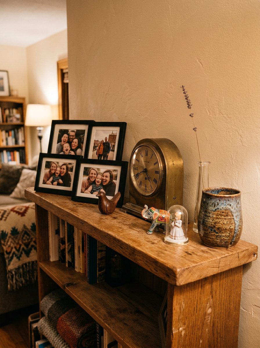
The shelves that feel most genuinely impressive aren’t the ones with the most expensive objects — they’re the ones that communicate something real about the person who lives there. Travel souvenirs, inherited objects, and handmade pieces all serve as conversation starters a purely decorative alternative can’t replicate.
There’s genuine research behind why this works: a study published in the Journal of Environmental Psychology, covered by ScienceDaily, found that people identify with their homes largely through the possessions kept inside them. The same research is a useful check on restraint, though — that identification has a documented downside once possessions tip into clutter, which is exactly why the goal here is a few genuinely meaningful pieces, not every keepsake at once. Coordinate frames in the same finish so a personal display reads as polished rather than randomly assembled.
Leave Negative Space for Visual Balance
Not every inch of shelf needs an object, and understanding this is one of the clearest lines between a well-styled shelf and an overcrowded one. Deliberate empty space between and above objects gives the eye resting points and makes the occupied sections feel more significant.
Overfilled shelves look cluttered regardless of how beautiful the individual pieces are — the empty space is precisely what gives the filled sections their weight. Vary the amount of empty space across different shelves deliberately: some levels fuller, others intentionally sparser. Step back regularly and remove one piece whenever the arrangement feels even slightly crowded.
Color Coordinate for Visual Cohesion
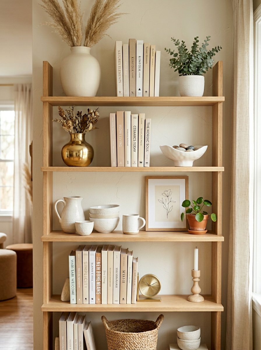
Choosing decorative objects within a defined palette creates immediate cohesion. This doesn’t mean everything is identical in colour — it means the tones work harmoniously rather than competing.
Coordinating book spine colours with surrounding decorative objects creates a particularly strong, unified effect. White, black, and blue spines alongside neutral ceramics and natural wood look clean together without any single piece needing to be special. A practical rule: choose two or three main tones and one accent, then work within that palette for every selection.
Style Kitchen Shelves with Practical Beauty
Kitchen shelves operate under a different set of requirements than living room or bedroom shelves, since function can’t be subordinated to appearance in a working kitchen — a similar practical-first mindset to the one running through our kitchen colour guide. The most successful kitchen shelf styling treats everyday functional items as design elements rather than hiding them.
Stacking mugs, displaying bowls, and organising canisters on open shelves blends storage with genuine style. A small potted herb or trailing plant adds warmth to a space that can otherwise feel clinical, and white oak or natural wood floating shelves complement most cabinet and countertop materials. Keep the most-used items at eye level rather than prioritising the arrangement over daily access.
Approach Bathroom Shelves with Restraint
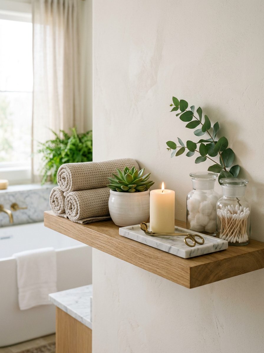
Bathroom shelves work best with more restraint than any other room, since small spaces clutter faster and humidity makes maintaining any arrangement harder — the same considerations that shape which bathroom vanity makes sense for a compact space apply here too.
Rolled towels in neutral tones, small ceramic pots, candles, and a single plant create a spa-like atmosphere that feels deliberately luxurious rather than cluttered. Keep personal care products minimal and organised in a small tray. Every item should earn its place through function, beauty, or both — apply the same height and negative-space principles as elsewhere, but edit more aggressively.
Use Cubby Shelves for Themed Display Sections
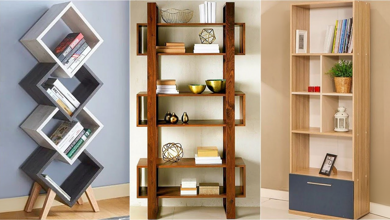
Cubby shelves create a natural structural advantage because each section provides a defined boundary that organises the display into distinct themed areas, letting a mix of objects and categories coexist without visual chaos across the whole unit.
Pair a stack of books with a single vase in one cubby, a small framed piece with a candle in another, a plant with a decorative tray in a third. Each cubby reads as its own mini-display while contributing to the overall look — particularly useful in living rooms, home offices, and children’s rooms where multiple categories need their own organised space.
Refresh Shelves Seasonally to Stay Current
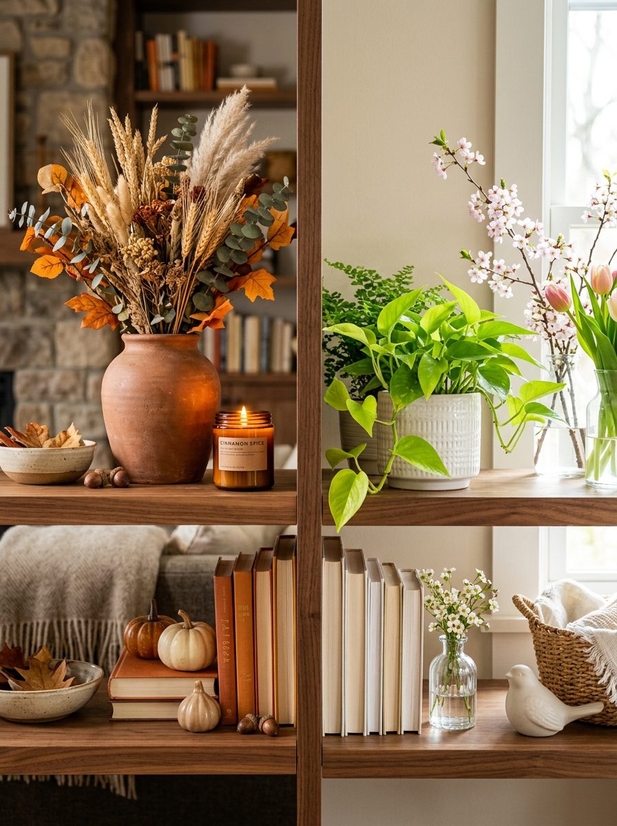
Changing shelf displays with the seasons keeps a home feeling current without requiring significant new purchases or a full redesign.
Rotating existing pieces between rooms, moving plants, swapping a candle colour, or adding one seasonal botanical element is often enough to give a familiar shelf a meaningfully fresh quality. Autumn calls for warm amber tones and dried botanicals; spring and summer invite brighter accents and fresh plants. This is also a natural opportunity to declutter — removing items that have stopped earning their place keeps the display current instead of gradually accumulating against it.
Common Shelf Styling Mistakes Worth Avoiding
Overcrowding is the most frequent and most damaging error. Filling every available inch without deliberate negative space makes shelves look cluttered regardless of how beautiful the individual pieces are — every inch filled means no resting point for the eye and no visual significance for any single object.
Placing all tall items together on one section and all short items on another creates a flat, static display with no rhythm. Using too many competing colours without a cohesive palette makes displays feel random, and ignoring personal meaning results in shelves that look styled but feel soulless — attractive from a distance but communicating nothing about the people who live with them. The most reliable check is stepping back regularly and viewing the whole arrangement from the distance it’ll actually be seen at in daily life; removing one piece whenever something feels even slightly off is almost always the right call.