Gallery Wall Ideas for Home – Creative and Stylish Display Tips
Gallery Wall Ideas for Home – Transform Any Wall in 2026
A blank wall is honestly one of the most underrated opportunities in any home. I walked past the empty wall in my hallway for months thinking I would sort it out eventually. When I finally put together a gallery wall, it became the most commented-on thing in the entire house. Guests notice it immediately, every single time.
The great thing about gallery walls is that there is no single right way to do them. Whether your home is minimal and modern, cosy and eclectic, or somewhere in between, there is a version of this that will work beautifully. You just need to understand a few basic principles before you start hammering nails into the wall.
Plan Your Layout Before Hanging a Single Nail in the Wall
View this post on Instagram
This is the most important piece of advice for anyone tackling their first gallery wall. Plan everything on the floor first. Lay all your frames out on the floor exactly as you intend to hang them. Step back, take a photo on your phone, and study it properly.
It gives you a complete view of the whole arrangement before you commit to anything. You will immediately spot awkward gaps, pieces that clash, or a layout that needs adjusting. Doing this on the floor costs you nothing. Doing it directly on the wall costs you a plaster repair and a lot of frustration.
Keep spacing between frames consistent. Two to three inches works well for most arrangements. Trace each frame onto kraft paper, cut it out, and tape the paper templates to the wall before drilling a single hole. Start with your largest piece first and build outward from there. Take a photo of your floor layout and keep it open on your phone while you hang.
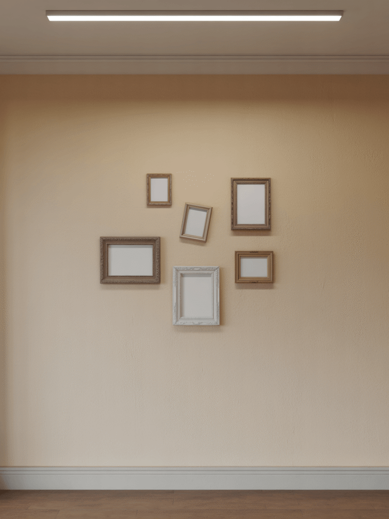
Symmetrical Grid Layout – Clean Modern Gallery Wall Style
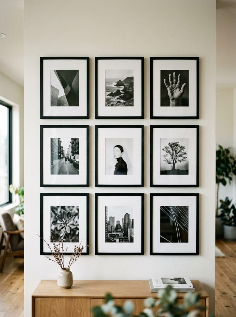
If you want a gallery wall that looks polished with minimal effort, the symmetrical grid is your best option. It is exactly what it sounds like. Identical frames arranged in a neat, evenly spaced grid.
A 3×3 or 4×2 grid of matching black frames with black and white photography is one of the sharpest things you can put on a bedroom or hallway wall. There is a reason interior designers keep coming back to this layout. It is clean, confident, and works in almost any room without any risk.
The key to making it look genuinely good is consistency. Same frames, same spacing, same mat border width on each print. If one element is off, the whole grid loses its impact. Get those three things right and the result looks professionally done every time.
It works especially well in home offices, bedrooms, and narrow hallways where the clean structure feels intentional.
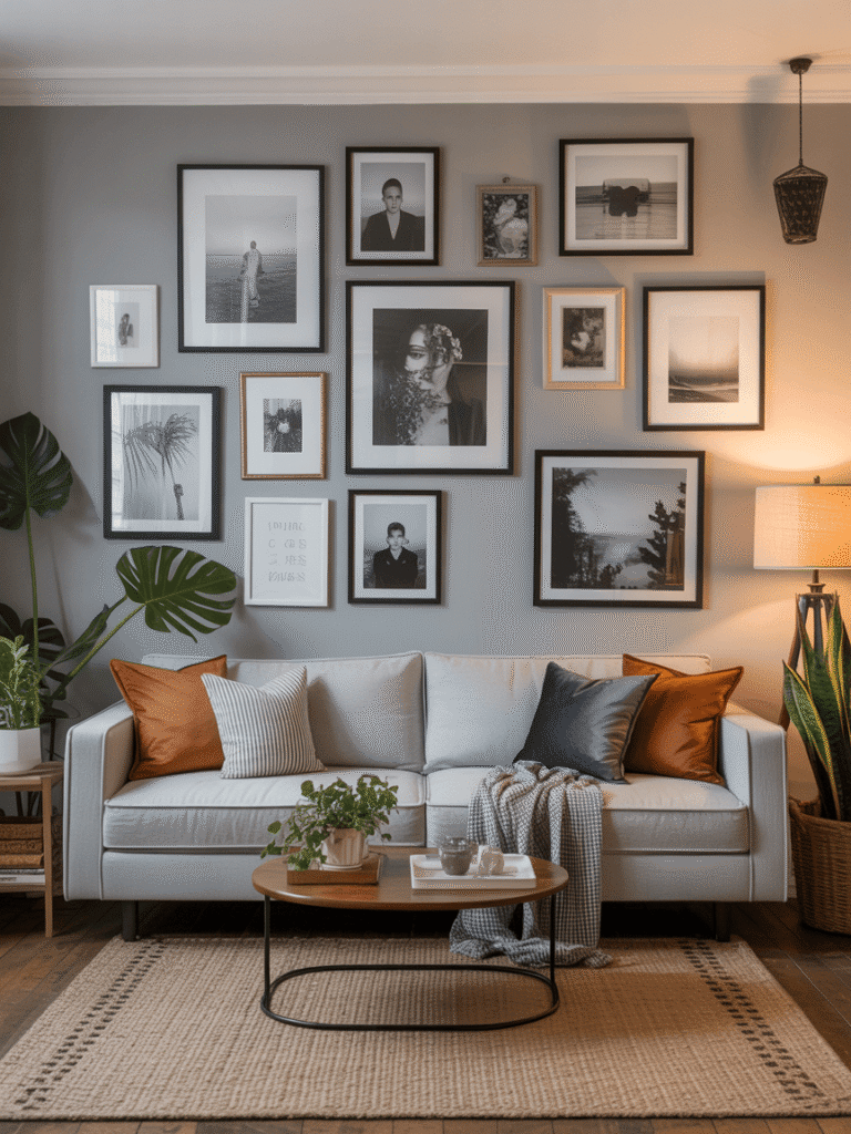
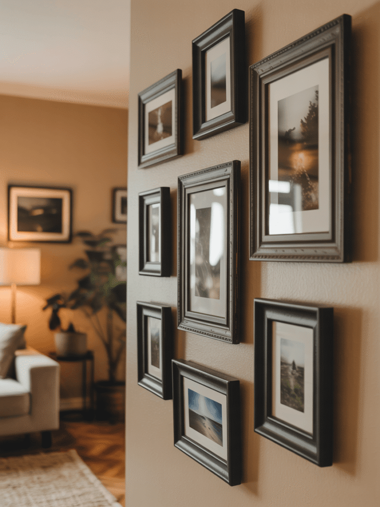
Eclectic Salon-Style Gallery Wall – Bold and Personality-Driven
View this post on Instagram
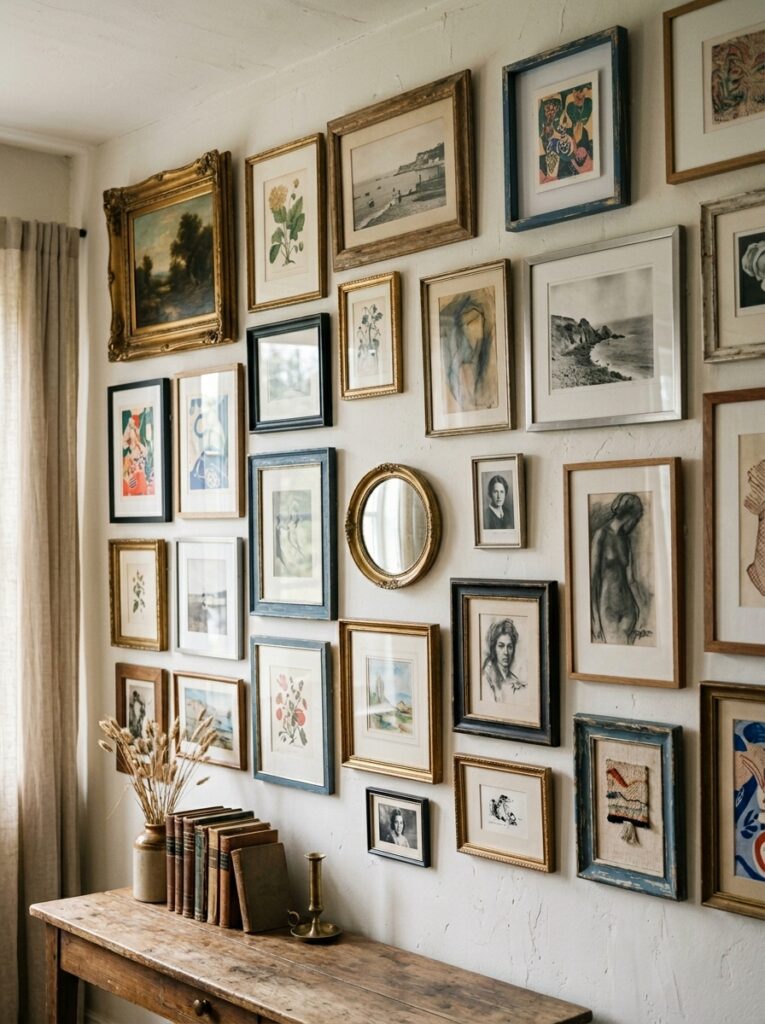
The salon style is the complete opposite of the grid and honestly it is much more fun to put together. The idea is that your wall looks like it has been collected over time rather than ordered from one shop on a single afternoon.
You mix different frame sizes, finishes, and styles. Prints, personal photos, small mirrors, maybe a piece of textile or a small mounted object. The frames do not match and that is entirely the point. The variety is what gives it character.
The trick to making it look intentional rather than chaotic is connecting the pieces with one consistent thread. It might be a recurring colour within the artwork or a similar mood across very different images. Even in the most eclectic arrangements there is usually something tying it together. You just have to figure out what that is for your particular space.
This style suits living rooms and creative spaces particularly well. If your home has a bohemian, maximalist, or vintage personality, the salon wall will feel completely natural.
Monochrome Gallery Wall – Sophisticated and Beautifully Restrained
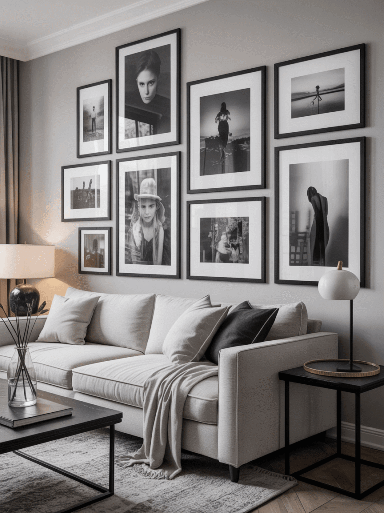
A monochrome gallery wall sounds simple but it delivers serious impact. The concept is restricting your art and frames to a single colour family, most commonly black, white, and grey, and letting that restraint do all the work.
Black frames with black and white photography in a range of sizes is the most classic version. It suits modern, Scandinavian, and Japandi interiors beautifully and it photographs very well if that matters to you.
Vary the sizes of your prints so the wall has rhythm. A large landscape print next to two smaller portraits next to a medium square piece, that kind of variation stops a monochrome wall from feeling flat. Keep the frame finish consistent and let the images carry the visual interest.
Family Photo Gallery Wall – Personal and Genuinely Heartfelt Display
View this post on Instagram
There is something genuinely lovely about a well done family photo gallery wall. When the photos are properly printed and framed consistently, it stops looking like a collection of snapshots and starts feeling like a considered display.
The most common mistake is using consumer printed photos at small sizes. Get your photos printed at a proper size, at least some of them at 8×10 or larger, and the whole thing lifts immediately. The difference between a good print and a home inkjet print is much bigger than most people expect.
Coordinate your frames rather than matching them exactly. A mix of black and natural wood frames feels warm and collected without looking random. Include a range of photo sizes, mix portrait and landscape orientations, and make sure at least one or two images are large enough to anchor the whole arrangement.
Mixed Media Gallery Wall – Art, Mirrors, and Texture Combined
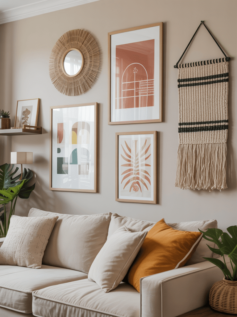
One of the most visually interesting gallery walls you can put together goes beyond frames entirely. Adding a decorative mirror, a small wall mounted shelf, or a woven textile piece changes the whole character of the display.
A mirror is particularly useful. It reflects light, creates depth, and breaks up the flat surface of framed prints in a way that feels genuinely dynamic. Position it somewhere in the middle of the arrangement or slightly off centre for the most natural result.
The key with mixed media is keeping one element consistent so the variety feels curated rather than accidental. That might be sticking to one colour palette across all pieces, or keeping a consistent frame finish even when the types of objects vary. That one shared element is what separates a collected wall from a cluttered one.
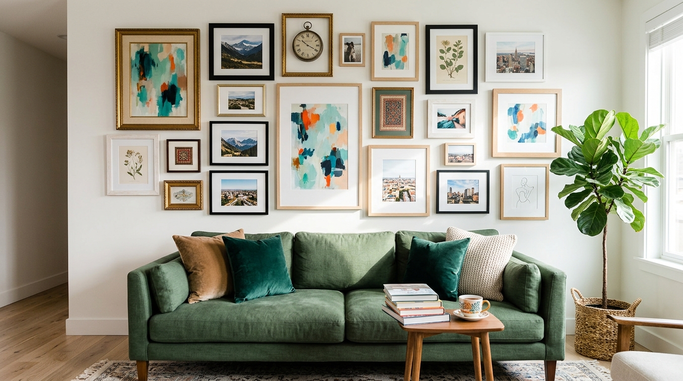
Above-Sofa Gallery Wall – Classic and Powerful Living Room Display
Hanging a gallery wall above the sofa is one of the most reliable moves in home decorating. The sofa gives the display a clear anchor point and the scale relationship between furniture and wall art feels immediately balanced.
The gallery wall should span roughly two thirds of the sofa’s width. This keeps it proportional without overwhelming the furniture underneath.
The lowest frame in the arrangement should sit about eight to ten inches above the sofa back. Any higher and the connection between furniture and art feels broken. Any lower and it becomes uncomfortable for anyone sitting back against the sofa.
Use one larger piece as a centrepiece and arrange smaller pieces around it. This creates a visual order that reads as designed rather than accidental.
Staircase Gallery Wall – Dramatic and Beautifully Proportioned Display
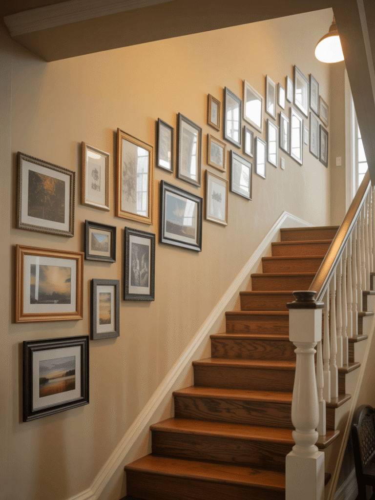
If you have a staircase with wall space, it is one of the best locations for a gallery wall in the entire house. The ascending angle creates a natural flow that guides the eye upward and the vertical space allows for a display that would be too tall to work anywhere else.
Follow the angle of the staircase with your frames, ascending in a diagonal line that mirrors the stairs beneath. Keep the spacing consistent and the arrangement reads as genuinely impressive rather than just busy.
A mix of frame sizes works well here. Larger pieces at the bottom, gradually reducing in size as they go up, creates a proportional logic that feels visually correct. Family photos mixed with landscape prints tell a visual story as you climb the stairs.
A spirit level is essential on a staircase wall. Even small variations in alignment are very obvious when frames are following an angled line.
Bedroom Gallery Wall – Personal Retreat Display Above the Bed
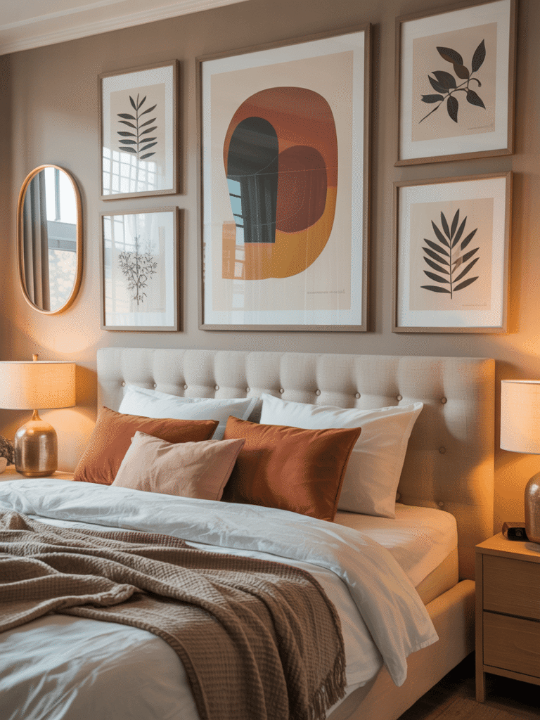
A gallery wall above the headboard is one of the most impactful things you can do in a bedroom. It creates a clear focal point, anchors the bed visually, and gives the room a designed quality that an empty wall simply cannot achieve.
In 2026, bedroom gallery walls tend toward warm, personal arrangements. A large abstract print at the centre, smaller botanical illustrations on either side, maybe an oval or round gold framed mirror mixed in. Earthy, warm tones work better in bedrooms than stark black and white.
Keep the palette cohesive. If your bedding and furniture are warm toned, your gallery wall should be too. Soft ambient lighting from a warm table lamp or wall mounted picture lights makes the whole display look genuinely beautiful at night.
Hallway Gallery Wall – Dramatic First Impression for Every Guest

The hallway is the first room anyone sees when they visit, which makes it one of the most valuable decorating opportunities in the whole house. A gallery wall in a hallway signals immediately that the home is considered and personal.
Because hallways are typically narrow, a vertical or linear arrangement works better than a sprawling one. Height is your friend here. A tall column of frames, or a linear arrangement that stretches along the full length of the wall, suits the space naturally.
Mix family photos with a piece of art and a small mirror. Add a wall mounted picture light if you want some drama. Keep the arrangement tight and the frames well chosen and your hallway will become the most remarked on space in your home.
How to Choose the Right Frame Style for Your Gallery Wall
Frame selection is where a lot of gallery walls go wrong. The most common mistake is buying whatever is available and hoping it all works together. It usually does not.
The most reliable approach is to keep one element consistent across all frames. That might be the finish, whether all black, all white, all natural wood, or all gold. Or the material, or even just the width of the frame itself. That consistency creates visual cohesion even when the art inside the frames is very different from piece to piece.
Mixing two complementary finishes works well too. Black and natural wood is a classic combination, as is white and gold. Mixing three or more finishes gets risky unless you are deliberately going for the eclectic salon look where variety is the entire point.
Thin minimalist frames suit modern and Scandinavian interiors. Wider, more substantial frames suit traditional or maximalist spaces. Match the frame character to the personality of the room it is going in.
How to Choose Art for a Gallery Wall That Tells Your Story
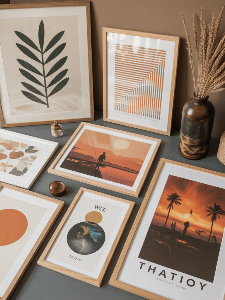
The gallery walls that genuinely resonate are the ones that include pieces with real personal meaning, not just aesthetically pleasing prints from a wall art shop. The most beautiful arrangement of expensive prints will still feel cold if there is nothing personal in it.
Start with one or two pieces that actually mean something to you. A photograph from a significant trip, a print from an artist you genuinely love, a page from a book that changed you. Build the rest of the wall around those anchor pieces.
For the remaining prints, look for cohesion in colour palette rather than subject matter. A botanical print, an abstract piece, a landscape, and a typography print can all coexist beautifully if they share similar warm or cool tones.
Do not rush this part. A gallery wall that grows slowly over time as you find pieces you genuinely love is almost always more interesting than one assembled in a single afternoon.
How to Light a Gallery Wall for Maximum Impact at Night
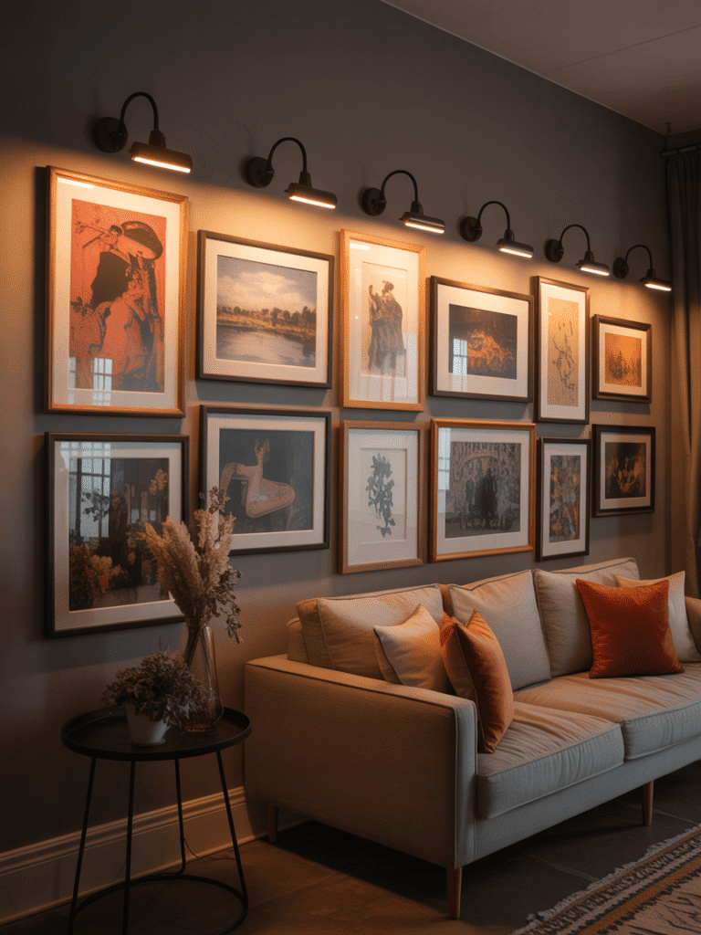
Most gallery walls look good in daylight. The ones that look genuinely impressive look that way at night too and the difference is almost always lighting.
Wall mounted picture lights positioned above key pieces cast a warm, directed glow that makes art come alive. LED strip lighting along the ceiling edge, angled toward the wall, creates a softer diffused effect that works well for larger arrangements.
Stick with warm white bulbs around 2700K to 3000K. Cool or blue toned lighting drains warmth and colour from artwork and makes any gallery wall look harsh regardless of how good the art actually is. Dimmable bulbs are worth the extra cost. Being able to turn the display down low for evening atmosphere is something you will use constantly.
Even a single well placed lamp near your gallery wall will make a significant difference. Lighting is always the most underrated part of this kind of project.
Common Gallery Wall Mistakes to Avoid at Home in 2026
Hanging everything too high is the biggest one. Art should hang at eye level, which means the centre of the arrangement should sit around 57 to 60 inches from the floor. Most people hang art too high, which disconnects it visually from the room and makes everything feel slightly off without knowing why.
Inconsistent spacing is the second most common issue. Gaps between frames should be the same throughout the arrangement. Even a half inch difference between two gaps is surprisingly noticeable once the wall is finished and you step back to look.
Frames that are too small for the wall look lost and timid. When in doubt, go slightly larger than you think you need. What looks big on the floor often looks exactly right on the wall.
Buying everything from one place is a trap. A wall where every frame and every print came from the same shop looks flat and commercial. Mix your sources and your art will feel more alive.
DIY Gallery Wall Tips – Create a Beautiful Display on Any Budget
Creating a gallery wall that looks genuinely considered does not require spending a lot of money. Some of the best ones are assembled almost entirely from charity shops, downloadable prints, and frames spray painted in a unified colour.
Thrift stores and estate sales are excellent sources for frames with real character. A can of matte black or white spray paint turns a mismatched set into a cohesive collection in an afternoon.
Print your own artwork. Sites like Unsplash offer free high resolution photography you can download and print locally. A good print shop will produce an A3 or A4 photo for very little money and the quality is far better than home printing.
For renters or anyone who does not want to commit to nail holes, adhesive picture hanging strips work well for lighter frames and leave no damage when removed. They are not suitable for heavy pieces but for a lightweight mixed arrangement they are a completely practical solution.
A beautiful gallery wall is one of those home projects where creativity matters more than budget. The best ones are almost always the most personal ones.