Coffee Table Decor Ideas: Stylish Centerpiece Styling Tips 2026
The coffee table is the most looked-at surface in any living room. It sits at the centre of every conversation and every quiet evening, yet most people either leave it bare or pile it with whatever lands there through the week — neither approach does the room any favours.
A well-styled coffee table anchors the whole room and makes the space feel considered rather than simply furnished. None of it requires an expensive purchase — just a handful of reliable principles applied consistently. If a broader living-room refresh is on the cards rather than just this one surface, our home entrance design guide is a good place to carry the same intentional approach through to the first room a guest actually sees.
Start with a Tray: The Most Important First Step
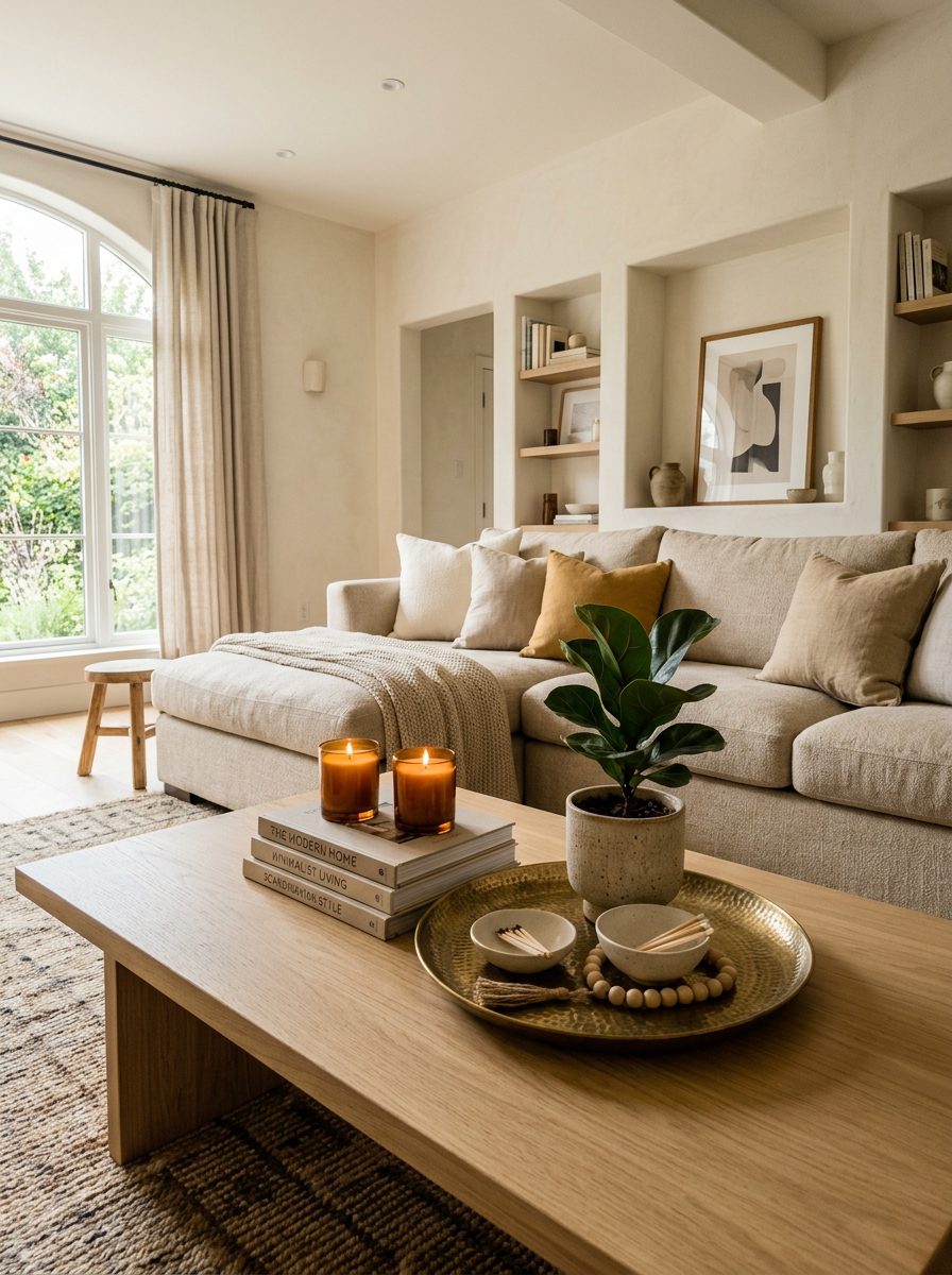
A tray is the single most important starting point in any coffee table strategy. It creates a defined boundary that anchors smaller objects together and turns a random collection of items into something that reads as intentional.
Woven rattan trays add organic warmth, marble with gold handles reads as more luxurious, and lacquered wood suits a cleaner, more modern look. A mirrored tray reflects light and adds extra depth on a smaller table — the same principle our mirror styling ideas lean on elsewhere in the house. Place a candle, a small plant, and one decorative object inside the tray together and the arrangement reads as complete rather than scattered. Always start here before adding anything else.
Use Books to Add Height, Warmth, and Personal Character
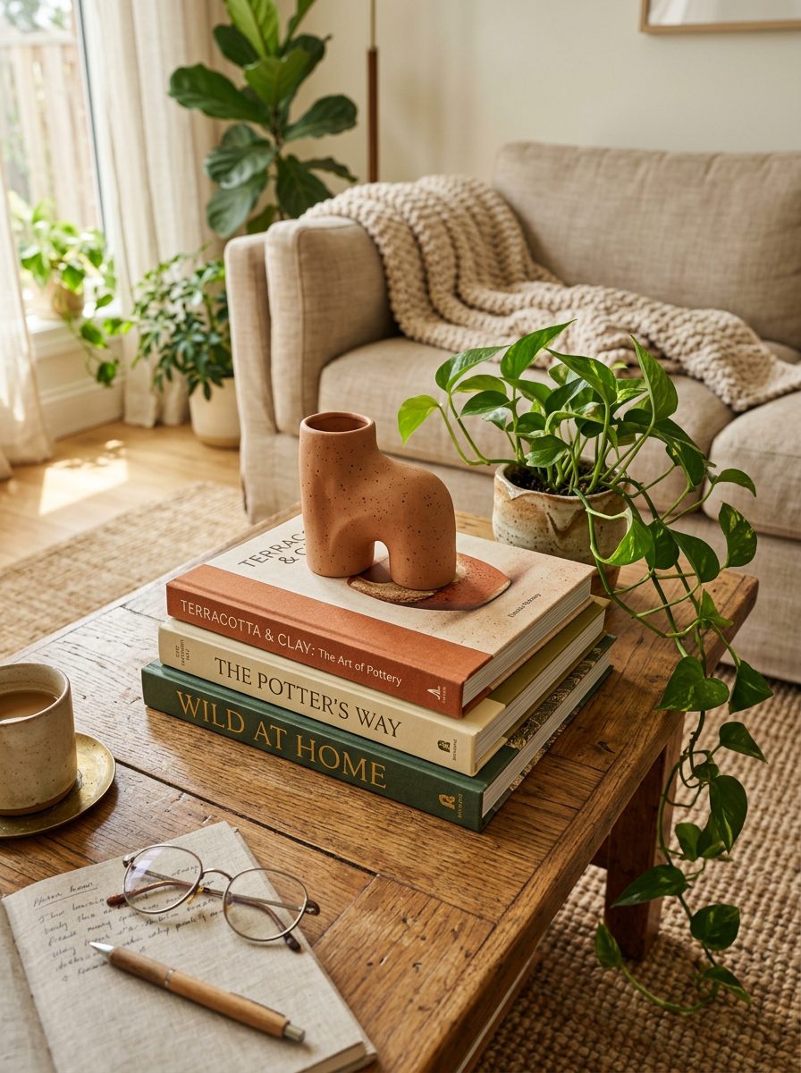
Books add height, warmth, and genuine personality in a way purely decorative objects rarely manage. Stacking two to four creates a natural riser for smaller objects on top, adding height variation at no extra cost.
Choose books that reflect genuine interests — art, travel, architecture — rather than ones picked purely for spine colour. Many professional stylists start every coffee table arrangement with books first and layer everything else around them. A small plant or candle placed on top of a horizontal stack finishes the look.
Add Candles for Atmosphere and Visual Texture
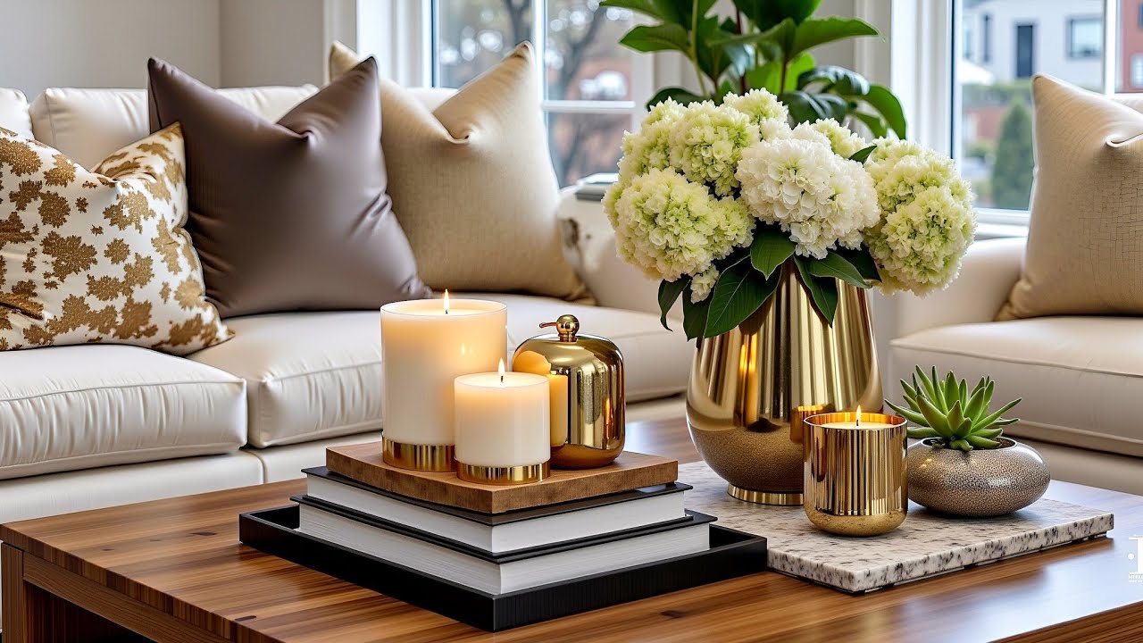
Candles do two things at once: they add warmth and glow when lit, and sculptural visual interest even when they aren’t. They suit everything from rustic farmhouse to sleek contemporary interiors and need no real styling skill to place well.
Varying candle heights across an arrangement creates movement — tall tapers add drama, short pillars add density lower down, and sculptural holders in brass or concrete add material richness plain candles can’t. Grouping three of different heights on a tray creates one of the strongest, most portable centerpieces on this whole list.
Apply the Rule of Threes for Natural Visual Balance
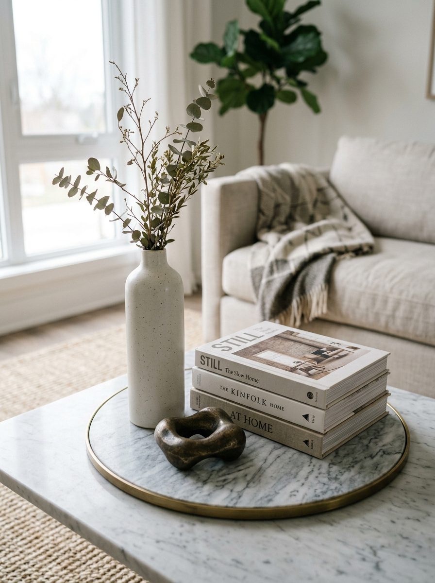
The rule of threes is one of the most useful styling principles for any surface, not just a coffee table. Interior designers interviewed by Ideal Home point to the same underlying reason it works: objects grouped in odd numbers, especially threes, tend to read as more balanced and natural than even groupings, which can feel stiff or overly staged by comparison.
The practical version is simple — group three objects of varying height, texture, and weight together on a tray or in one section of the table. A tall vase, a stack of books, and one small decorative object is a reliable starting trio. Apply it across every section of a larger table and the whole thing looks considered without any formal design background required.
Bring in Plants and Greenery for Natural Life
A small potted plant or a simple vase of fresh flowers changes the character of a coffee table arrangement immediately. Natural elements balance out the harder materials — glass, marble, metal — that tend to dominate this particular surface.
Silver dollar eucalyptus has become a popular choice for its soft, muted tone, and fresh seasonal stems in a clear glass vase add colour that no decorative object replicates. For rooms with limited natural light, a genuinely good faux plant does the same visual job without any maintenance at all.
Include a Sculptural Object for Artistic Depth
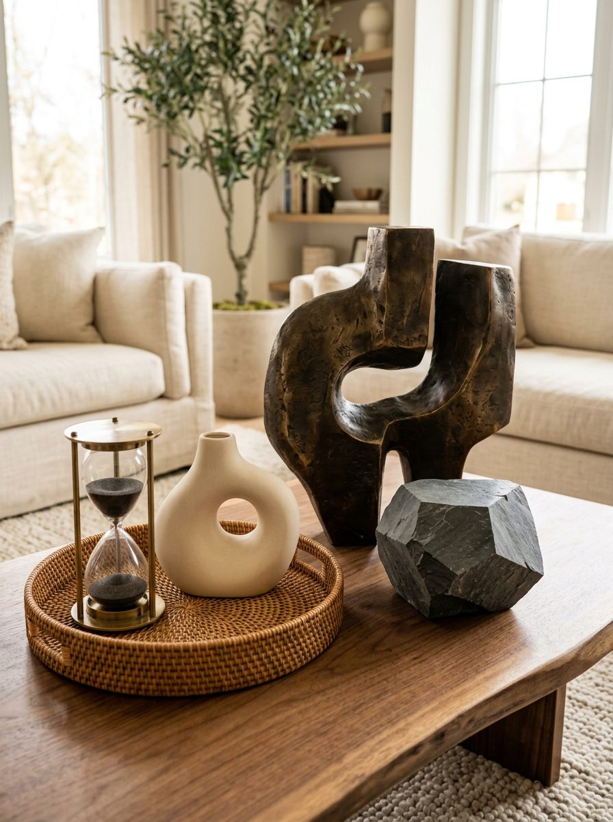
A sculptural object is the most personality-driven addition available. A well-chosen abstract ceramic piece or decorative figurine communicates real taste in a way standard decorative items rarely manage — the table becomes a small gallery moment rather than just a surface. Our wall decor ideas cover the same instinct applied vertically, if a coffee table piece leads you to want more of it in the room.
Sculptural pieces work best against contrast: a smooth ceramic form beside a textured woven tray, or a geometric stone object next to something organic and botanical. Even an hourglass or a decorative box can serve a similar role while adding a bit of narrative to the arrangement.
Build Height Variation Across the Entire Surface
Placing everything at the same level is the most common mistake that makes an arrangement look flat. Mixing tall, medium, and low objects creates a visual rhythm that guides the eye across the table instead of leaving it static.
Tall vases and stacked books form the upper level, small plants and medium ceramics sit in the middle, and low flat objects like coasters anchor the base. A small book or wooden block used as a riser lifts anything that would otherwise sit too low to earn its place in the arrangement’s range.
Mix Materials for Genuine Visual Richness
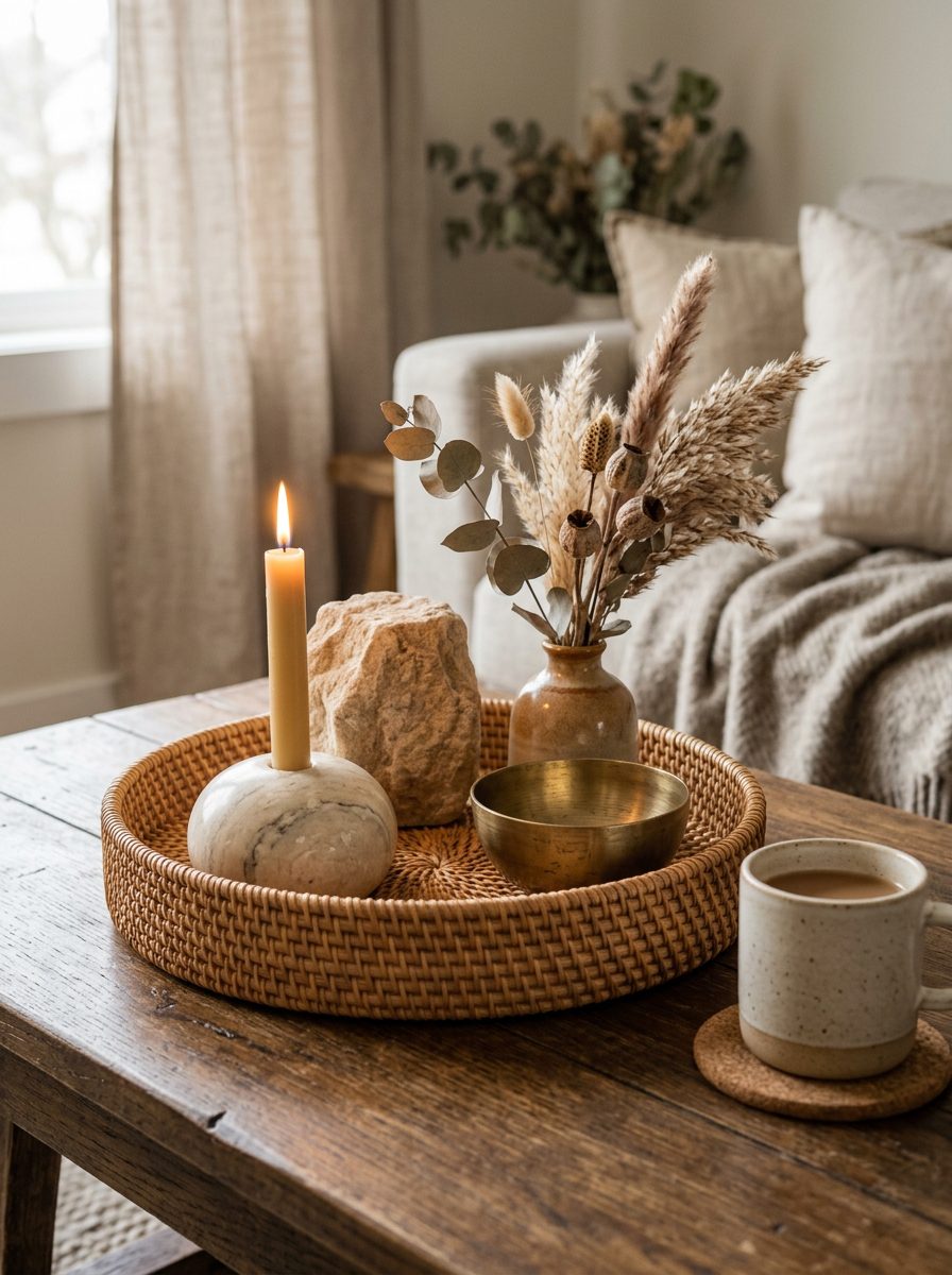
Combining wood, ceramic, glass, rattan, and metal in one arrangement creates depth that a single-material display can’t. The variation stops the eye scanning past too quickly and invites a closer look at each piece.
A woven rattan tray with a marble candle holder and a rough stone object creates real tactile interest. Even coasters contribute here — marble, cork, ceramic, and leather each bring something different. Aim for at least three material types across any single display for the most layered result.
Leave Negative Space Intentionally
Not every inch needs filling, and understanding that is the difference between curated and cluttered. Deliberately leaving space between objects gives the eye somewhere to rest and makes the filled sections feel more significant by comparison.
A reasonable guideline is styling roughly 60 to 70 percent of the surface and leaving the rest clear for daily use — drinks, remote controls, the things that need somewhere to land without disturbing the arrangement. The same restraint that keeps a small bathroom from feeling crowded, which our small bathroom remodel guide covers in more detail, applies just as directly here: step back, look from the sofa rather than from above, and remove one piece if it feels crowded. It almost always looks better immediately.
Match the Styling to Your Interior Aesthetic
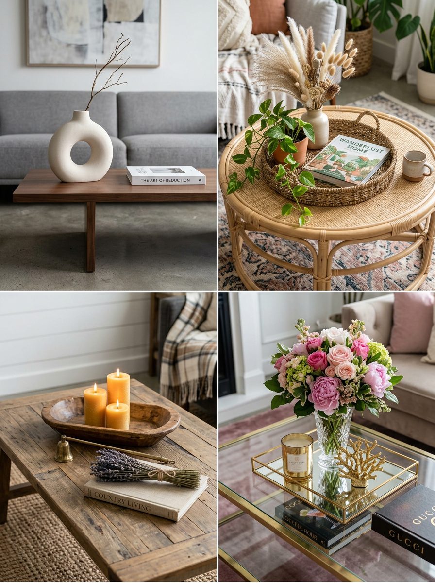
An arrangement that sits in harmony with the rest of the room always looks more considered than one that fights its surroundings. Different aesthetics call for genuinely different object choices.
Modern and minimalist interiors — the kind our minimalist home decor guide goes into at length — work best with clean lines and maximum negative space, where a single vase and one stack of books is enough. Farmhouse spaces suit woven trays and candlelight, bohemian rooms welcome layered textiles and trailing plants, and Scandinavian or Japandi styles prioritise natural materials and restraint above all else. Knowing which category a room belongs to before buying anything prevents mismatched purchases that never quite work no matter how attractive they looked individually.
Refresh the Display with Seasonal Changes
Swapping a few key elements with the seasons keeps a living room feeling current all year for very little extra investment, and it gives a natural reason to retire pieces that have stopped earning their place.
Autumn calls for warm amber candles and earthy ceramic vessels, spring and summer invite fresh flowers and pastel tones, and winter suits glossy whites, metallics, and soft candlelight. Building this into a household routine keeps the table feeling genuinely engaged with rather than set once and forgotten.
Build a Curated Book Collection Theme
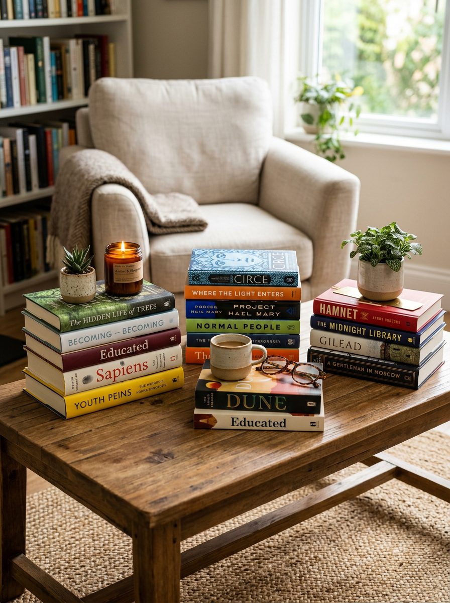
A themed book collection is one of the more personal approaches to coffee table styling available. The table becomes a small library that reflects genuine interests rather than a purely decorative surface.
Group three or four stacked piles of varying heights and let the spine colours become part of the design rather than an afterthought. Books on art, architecture, travel, or fashion communicate specific interests clearly, and layering a small object on top of each stack turns the whole thing into a proper vignette rather than just a pile.
Use Decorative Boxes to Hide Clutter Stylishly
Decorative boxes solve the most persistent coffee table problem: the slow accumulation of remotes, cables, and small items that undo every styling decision made around them. A well-chosen box hides all of that behind something that actually contributes to the arrangement.
Classic wood or lacquered boxes suit modern and traditional rooms equally, woven rattan adds bohemian warmth, and mirrored or metallic finishes suit more opulent interiors. A closed box also works as a riser — a small candle placed on top solves the clutter problem and adds height at the same time.
Scale Objects Correctly to the Table Size
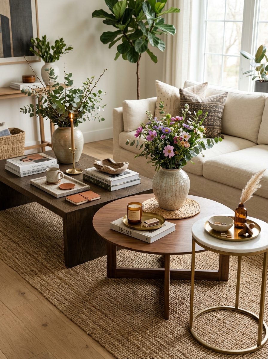
Scale is one of the most overlooked elements here and one of the most obvious when it’s wrong. The table’s size should shape every object choice that follows.
Large rectangular tables benefit from multiple grouped vignettes spread across the length rather than one central arrangement, keeping the display engaging from every seat. Small tables need genuine restraint — three to five items maximum, often within a single tray. Round tables suit one central arrangement radiating outward from a dominant anchor piece. Always account for the functional space actually needed before committing to a size of arrangement.
Common Coffee Table Styling Mistakes Worth Avoiding
Knowing what consistently goes wrong is as useful as knowing what looks good.
Overcrowding is the most frequent error — filling every inch without negative space makes even beautiful pieces look chaotic. Placing everything at the same height creates a flat arrangement with no visual rhythm, and too many competing colours without a unifying palette makes the whole thing feel accidental rather than considered.
Styling purely for appearance while ignoring daily use creates its own frustration — always leave functional space for drinks and everyday items. And ignoring scale cuts both ways: tiny objects disappear on a large table, and oversized ones overwhelm a small one. The simplest fix for most of this is sitting on the sofa, looking honestly at the table, and removing one piece whenever something feels slightly off.