
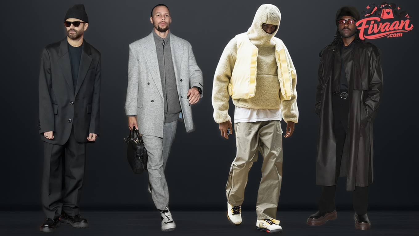
Best Monochrome Outfits for Men: Minimal Fashion That Looks Sharp
Monochrome dressing looks effortless from the outside and is one of the easier things to get wrong. Done right it reads as the most considered thing a man can wear. Done badly it reads as getting dressed in the dark.
The idea is simple enough: one colour, or closely related tones of it, across every piece. Two rules decide whether it works, and one practical problem sinks more monochrome outfits than bad taste ever has. Both come first, then the colours.
Two Rules That Do All the Work
Vary the tone. An outfit where every piece is the exact same shade reads as a uniform. A light top, a mid trouser and a darker shoe within one colour family reads as composed. The gap between pieces is what makes it look chosen.
Vary the texture. With colour contrast removed, fabric does all the visual work. A matte jersey against a smooth twill against suede creates depth that three pieces of identical fabric never will.
Those two rules apply to every colour below, so the sections that follow say what is specific to each one rather than repeating them.
Why Your Blacks Never Quite Match
This is the part no monochrome guide mentions, and it is the most common real-world failure. You put on black trousers and a black jacket and they are visibly two different blacks under daylight.
It is not your eyes and it is not the price. Different fibres physically cannot take the same dye. As the technical overview of textile dyeing sets out, wool and silk are coloured with acid dyes, polyester needs disperse dyes, acrylic takes basic dyes, and cotton uses a different range again. A black wool trouser and a black cotton tee were never dyed with the same chemistry, so they will never land on the same black.
Washing widens the gap. Cotton fades toward grey-brown faster than wool or polyester does, so a matching pair drifts apart over a year.
Three practical responses. Check pieces together in daylight rather than under shop lighting, because retail lighting hides tonal mismatch deliberately. Buy black separates in the same fibre where you want them to read as one. Or stop fighting it and make the difference obvious, since a clearly lighter and a clearly darker black look intentional where two near-identical blacks look like a mistake.
The same applies to white, which splits into cool white, warm white and cream, and to navy, which ranges from blue-black to almost purple.
All Black
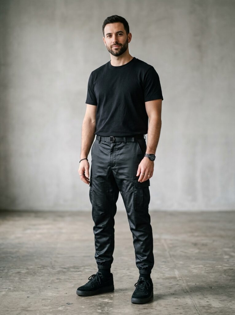
The one most men try first. Black defines a silhouette, hides transitions between pieces, and never fails outright. The only real question is whether it is interesting.
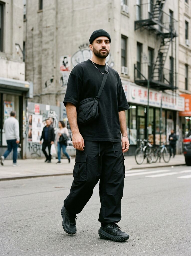
It changes character completely depending on the pieces. A structured blazer over a turtleneck over slim trousers reads editorial. An oversized tee, wide-leg trousers and chunky sneakers reads streetwear, carrying urban weight the tailored version does not. A black suit with a black shirt is the most deliberate formal choice available, though it punishes poor fit harder than anything else, because there is nothing to pull the eye away from the silhouette.
All White
Requires a specific confidence, which is part of why it lands. White reads as open and at ease where dark colours read as protective.
It performs best in summer light and in natural fabrics. Linen, cotton twill and clean leather give it depth that its simplicity does not suggest.
The upkeep is the honest cost. White also demands the most tonal precision of any colour here, since the cool-versus-warm split is highly visible.
Cream and Off-White
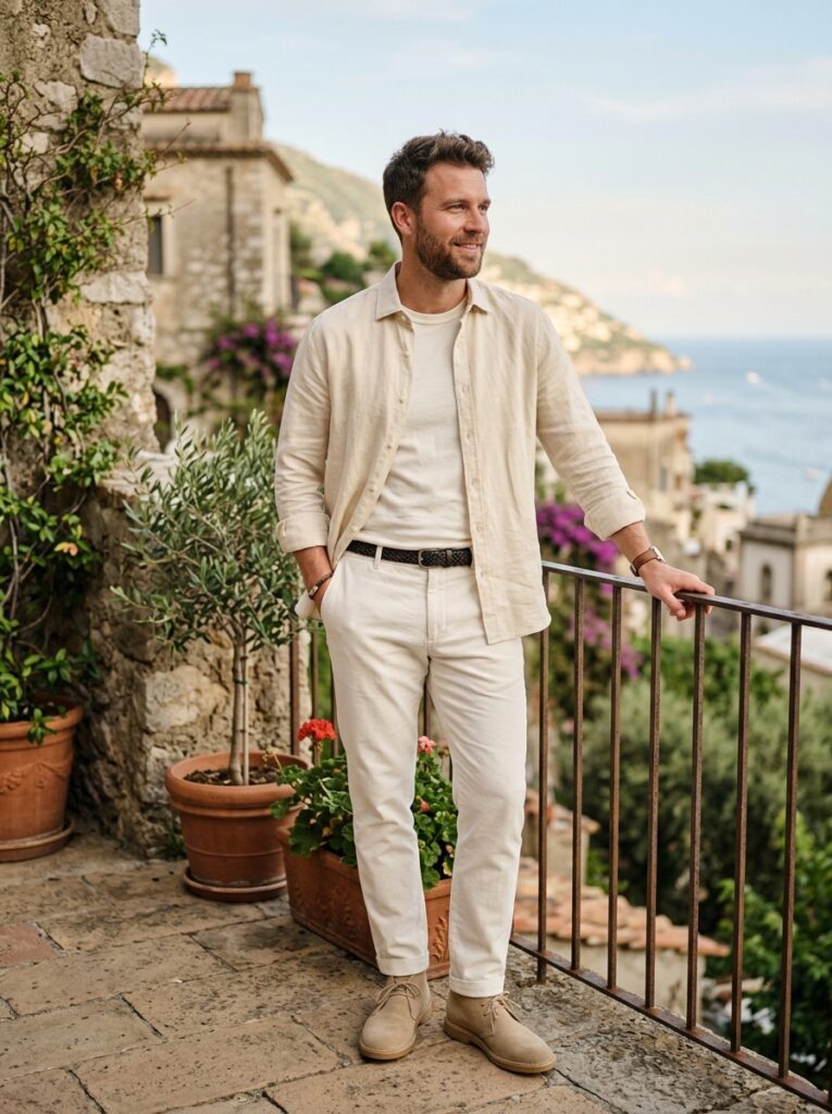
The practical answer for anyone who wants light monochrome without the precision. Cream forgives what white exposes.
Where pure white can read clinical in certain light, cream always reads warm. And because the family already contains variation, slight mismatches between pieces look intentional rather than careless.
All Grey
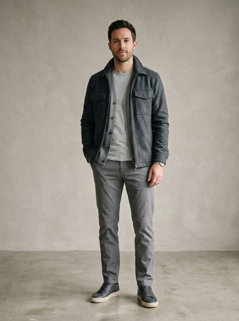
The colour most men skip, because it sits quietly between the boldness of black and the confidence of white. That quietness is the point.
Grey has the widest usable tonal range of anything here. Pale dove against deep charcoal in one outfit is subtle enough to stay cohesive and distinct enough to hold attention. It also suits nearly every skin tone and crosses casual to formal without adjustment.
Charcoal
Worth separating from grey, because it does something black cannot. Charcoal has enough internal variation to layer three related tones in one outfit.
A charcoal knit under a darker coat over charcoal trousers gives depth that flat black never reaches. The mid-dark range also bridges warm and cool undertones, so pieces from different fabrics sit together more forgivingly.
All Navy
Carries the same visual weight as black with added warmth, which makes it the more approachable alternative.
It also photographs unusually well, which matters more than it used to. The range from pale chambray to deep midnight gives plenty of room for tonal layering.
One caution: navy shifts more between light sources than any other colour here. Check it in daylight before committing to a pairing.
Slate Blue

Sits between navy and grey and takes qualities from both: the depth of blue, the calm of grey.
Most wardrobes do not hold enough slate blue to build a full outfit, which is exactly why wearing one reads as a genuine decision rather than a default. Familiar enough to be comfortable, uncommon enough to register.
All Beige
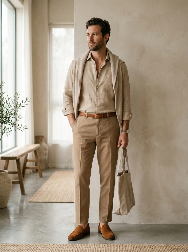
Beige manages to look minimal and expensive at once, which brighter colours cannot do without real effort.
Linen in warm sand, trousers in a deeper tan, suede in cognac. That reads as relaxed luxury rather than deliberate minimalism. It is also the colour most punished by getting the tonal rule wrong, since flat beige throughout washes out fast. A darker shoe anchoring the bottom fixes most of it.
The same restraint underpins our guide to neutral tone outfits for men.
All Camel
The colour most directly associated with quality, partly because the fabrics that carry it well are themselves expensive ones.
A camel rollneck, camel trousers and tan leather reads quietly costly without the wardrobe actually being so. The range from pale honey to deep tobacco gives the tonal room, and the warmth works with autumn and winter light rather than against it.
It also sits at the centre of the aesthetic covered in our guide to old money style.
All Brown
Underused and consistently impressive. From pale camel through rich chocolate, brown reads grounded in a way cooler neutrals do not.
Its practical advantage is accessories. Brown leather belts, watch straps and bags fold into the palette naturally, where in other colour schemes they read as coincidental. Matching leathers is covered further in our men’s footwear guide.
All Olive
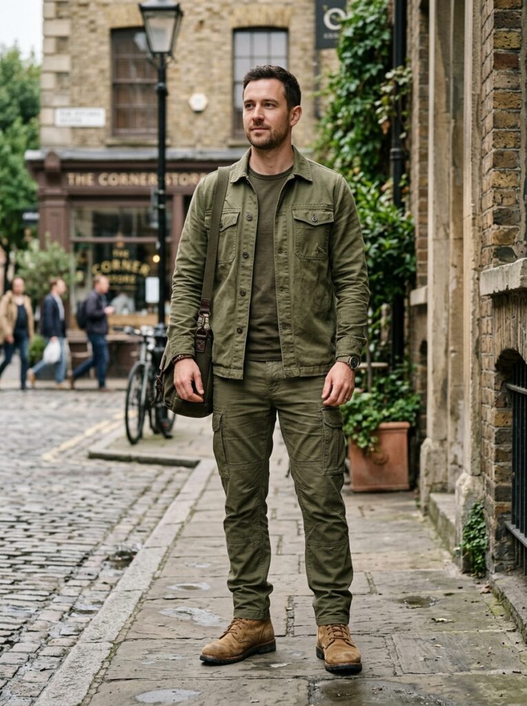
Military heritage and contemporary streetwear relevance at the same time, which gives it a quiet authority few palettes manage.
Olive is also the most texture-friendly colour here. Ripstop against soft cotton against suede gives real variation. And drifts toward tan or khaki within the outfit read as tonal rather than mismatched, which makes it unusually forgiving.
All Burgundy
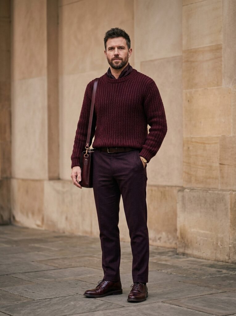
The most adventurous option on this list. Almost nobody builds a full outfit around burgundy, which is exactly why it reads as deliberate.
The range from pale rosewood to deep oxblood gives enough variation to avoid a uniform. It suits autumn and winter, and reads particularly naturally against olive and deeper skin tones.
Start with two pieces rather than a full outfit if it is unfamiliar territory. Colour pairing generally is covered in our guide to the best color combinations for men.
The Tonal Grey Suit
A mid-grey suit with a lighter grey shirt and no tie is the most forward-thinking version of formal dressing available, and it is simpler than it sounds.
Removing the contrasting shirt removes the colour break at the collar and lapel. The suit’s cut and cloth then carry the whole outfit uninterrupted, which reads architectural rather than assembled.
A white pocket square is the one accent that works without breaking the logic. Where this sits against conventional dress codes is covered in our guide to business casual outfit ideas.
Where to Start
Pick the colour you already own most of. Monochrome fails when it becomes a shopping project, because buying five new pieces in one colour is how men end up with an outfit that fits nothing else in the wardrobe.
For most men that means grey, navy or black. Lay three pieces out in daylight, check the tones are genuinely different rather than nearly the same, and check the fabrics are not all identical.
If they pass both tests, the outfit will work. If they fail either one, the problem is not the colour.