Gallery Wall Ideas for Home – Creative and Stylish Display Tips
Gallery Wall Ideas for Home – Transform Any Wall in 2026
A blank wall is honestly one of the most underrated opportunities in any home. I walked past the empty wall in my hallway for months thinking I would sort it out eventually. When I finally put together a gallery wall, it became the most commented-on thing in the entire house. Guests notice it immediately, every single time.
The great thing about gallery walls is that there is no single right way to do them. Whether your home is minimal and modern, cosy and eclectic, or somewhere in between, there is a version of this that will work beautifully. You just need to understand a few basic principles before you start hammering nails into the wall.
Plan Your Layout Before Hanging a Single Nail in the Wall
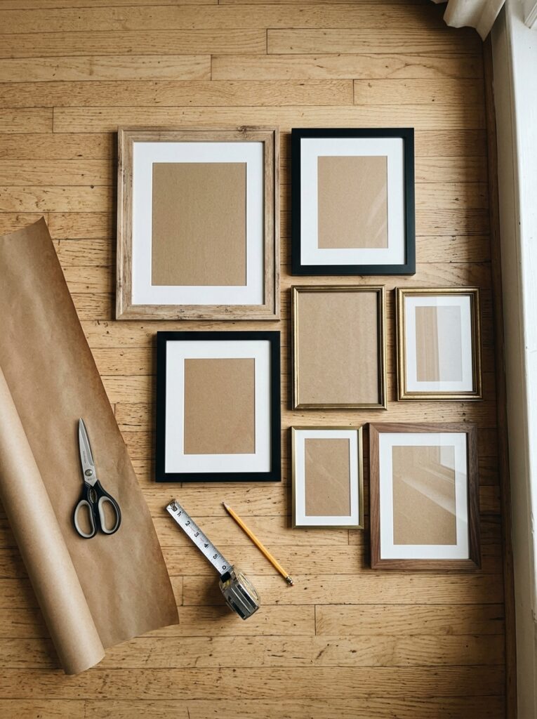
This is the most important piece of advice for anyone tackling their first gallery wall. Plan everything on the floor first. Lay all your frames out on the floor exactly as you intend to hang them. Step back, take a photo on your phone, and study it properly.
It gives you a complete view of the whole arrangement before you commit to anything. You will immediately spot awkward gaps, pieces that clash, or a layout that needs adjusting. Doing this on the floor costs you nothing. Doing it directly on the wall costs you a plaster repair and a lot of frustration.
Keep spacing between frames consistent. Two to three inches works well for most arrangements. Trace each frame onto kraft paper, cut it out, and tape the paper templates to the wall before drilling a single hole. Start with your largest piece first and build outward from there. Take a photo of your floor layout and keep it open on your phone while you hang.
Symmetrical Grid Layout – Clean Modern Gallery Wall Style
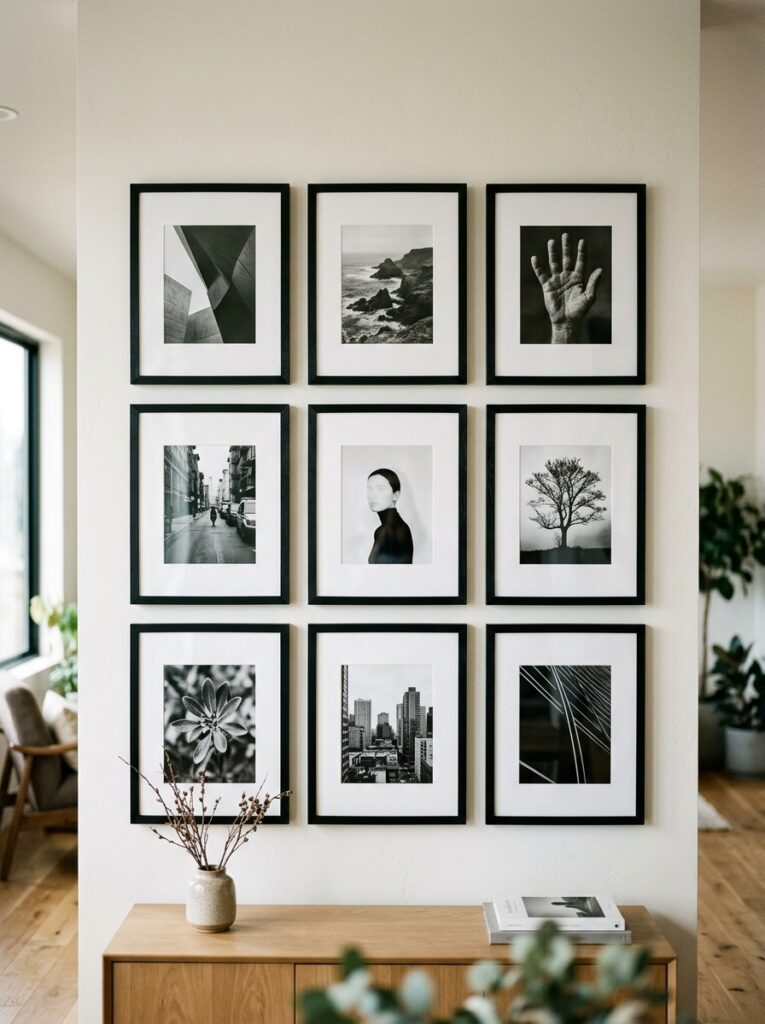
If you want a gallery wall that looks polished with minimal effort, the symmetrical grid is your best option. It is exactly what it sounds like. Identical frames arranged in a neat, evenly spaced grid.
A 3×3 or 4×2 grid of matching black frames with black and white photography is one of the sharpest things you can put on a bedroom or hallway wall. There is a reason interior designers keep coming back to this layout. It is clean, confident, and works in almost any room without any risk.
The key to making it look genuinely good is consistency. Same frames, same spacing, same mat border width on each print. If one element is off, the whole grid loses its impact. Get those three things right and the result looks professionally done every time.
It works especially well in home offices, bedrooms, and narrow hallways where the clean structure feels intentional.
Eclectic Salon-Style Gallery Wall – Bold and Personality-Driven
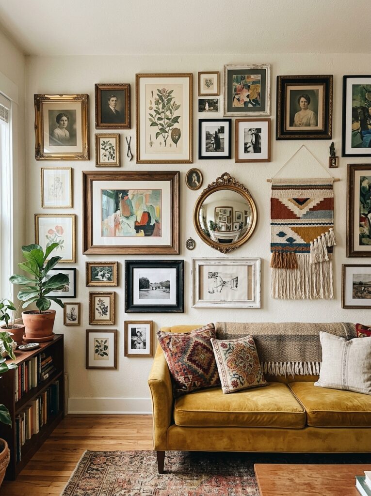
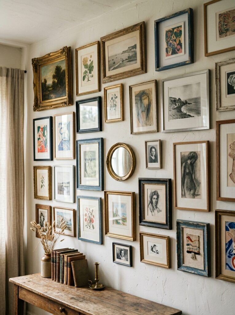
The salon style is the complete opposite of the grid and honestly it is much more fun to put together. The idea is that your wall looks like it has been collected over time rather than ordered from one shop on a single afternoon.
You mix different frame sizes, finishes, and styles. Prints, personal photos, small mirrors, maybe a piece of textile or a small mounted object. The frames do not match and that is entirely the point. The variety is what gives it character.
The trick to making it look intentional rather than chaotic is connecting the pieces with one consistent thread. It might be a recurring colour within the artwork or a similar mood across very different images. Even in the most eclectic arrangements there is usually something tying it together. You just have to figure out what that is for your particular space.
This style suits living rooms and creative spaces particularly well. If your home has a bohemian, maximalist, or vintage personality, the salon wall will feel completely natural.
Monochrome Gallery Wall – Sophisticated and Beautifully Restrained
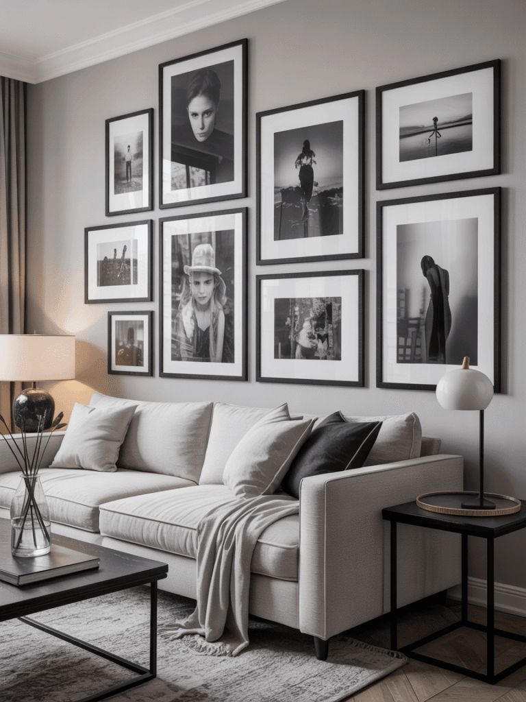
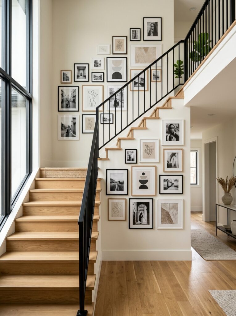
A monochrome gallery wall sounds simple but it delivers serious impact. The concept is restricting your art and frames to a single colour family, most commonly black, white, and grey, and letting that restraint do all the work.
Black frames with black and white photography in a range of sizes is the most classic version. It suits modern, Scandinavian, and Japandi interiors beautifully and it photographs very well if that matters to you.
Vary the sizes of your prints so the wall has rhythm. A large landscape print next to two smaller portraits next to a medium square piece, that kind of variation stops a monochrome wall from feeling flat. Keep the frame finish consistent and let the images carry the visual interest.
Family Photo Gallery Wall – Personal and Genuinely Heartfelt Display
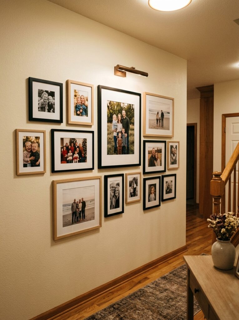
There is something genuinely lovely about a well done family photo gallery wall. When the photos are properly printed and framed consistently, it stops looking like a collection of snapshots and starts feeling like a considered display.
The most common mistake is using consumer printed photos at small sizes. Get your photos printed at a proper size, at least some of them at 8×10 or larger, and the whole thing lifts immediately. The difference between a good print and a home inkjet print is much bigger than most people expect.
Coordinate your frames rather than matching them exactly. A mix of black and natural wood frames feels warm and collected without looking random. Include a range of photo sizes, mix portrait and landscape orientations, and make sure at least one or two images are large enough to anchor the whole arrangement.
Mixed Media Gallery Wall – Art, Mirrors, and Texture Combined
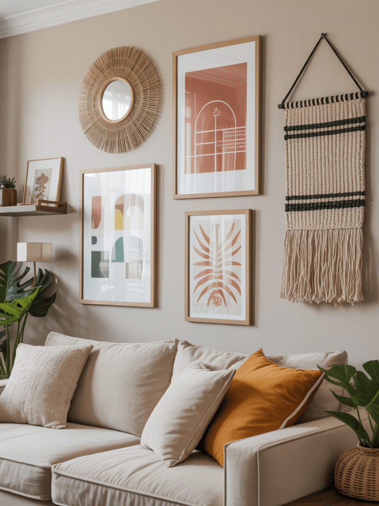
One of the most visually interesting gallery walls you can put together goes beyond frames entirely. Adding a decorative mirror, a small wall mounted shelf, or a woven textile piece changes the whole character of the display.
A mirror is particularly useful. It reflects light, creates depth, and breaks up the flat surface of framed prints in a way that feels genuinely dynamic. Position it somewhere in the middle of the arrangement or slightly off centre for the most natural result.
The key with mixed media is keeping one element consistent so the variety feels curated rather than accidental. That might be sticking to one colour palette across all pieces, or keeping a consistent frame finish even when the types of objects vary. That one shared element is what separates a collected wall from a cluttered one.
Above-Sofa Gallery Wall – Classic and Powerful Living Room Display
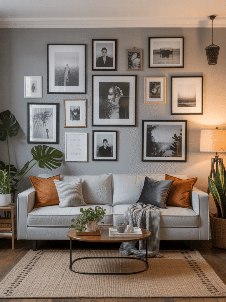
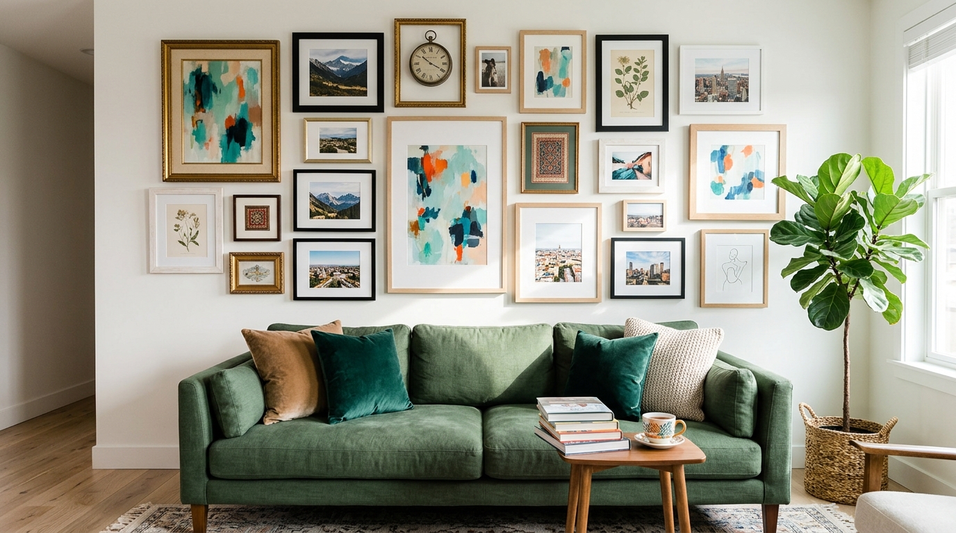
Hanging a gallery wall above the sofa is one of the most reliable moves in home decorating. The sofa gives the display a clear anchor point and the scale relationship between furniture and wall art feels immediately balanced.
The gallery wall should span roughly two thirds of the sofa’s width. This keeps it proportional without overwhelming the furniture underneath.
The lowest frame in the arrangement should sit about eight to ten inches above the sofa back. Any higher and the connection between furniture and art feels broken. Any lower and it becomes uncomfortable for anyone sitting back against the sofa.
Use one larger piece as a centrepiece and arrange smaller pieces around it. This creates a visual order that reads as designed rather than accidental.
Staircase Gallery Wall – Dramatic and Beautifully Proportioned Display